ShopDreamUp AI ArtDreamUp
Deviation Actions


Comments43
Join the community to add your comment. Already a deviant? Log In
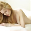
Sorry to say, but you could have done more with this image and model.
There is nothing wrong, its just too safe, and too much of same tones, the same same image, as seen everywhere. Don't see your style in this image.
No element stands out, so there is no feature to draw you into the photo, even the eyes, and nice bone structure, did not lift it up.
The model is physically cute, but she has stunning eyes. Use her features. All the pink and red tones of lips, nipples and ring is flat and unsaturated, making the tonal flat image flatter.
Her skin is pale, and you have lots of natural window light, you dressed her in white. It would make sense if you were going for high key lighting, but something is missing. Whats wrong with using a prop or colour to brighten up the image.
The white wall and white curtains along with tight vertical cropping looks unbalanced. crop out some of the window, have a look at how it changes the image, the rule of thirds works for a reason (break the rule if it works)
Don't be discouraged, we all make mistakes, thats a good thing, you learn from them. Best thing about this image, is you put it out there for crit, which is a hard thing to do, as were all passionately involved in our work. kudos for that alone.